News — colour palette
The Agony and the Ecstasy of Oil Painting
The Agony and the Ecstasy of Oil Painting
Jac Scott
A friend recently asked me if I ever get bored painting the coast? My reply came easily - the coastline is always changing, in every second it metamorphoses. Aiming and failing to capture that energy or tranquility is so bewitching that I'll never master it or tire of trying to do so.
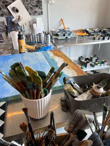
Painting the Norfolk Coast
The elements of sky, sea and shore dance and shift continually. It's the movement and the interplay of the elements that is beguiling. Standing before the ocean and absorbing the sights, sounds and smells to carry home to the studio, is both humbling and invigorating. I find making short videos of the panorama can help the journey, but nothing matches the initial excitement of the moment. Doing quick sketches and colour studies are an intrinsic part of the process. The large scale I prefer to work at demands a big set up, so it is highly problematic working on location.

Painting Simple Compositions with Complicated Layers
The compositions are rudimentary - I really like that. Capturing the viewer's eye without an obvious focal point demands other elements of interest and nuance. Colour and texture are key. The process is dynamic. It makes it even more challenging to carry that simplicity and create a picture that has depth, movement and spirit. The techniques I use embraces this - nurturing the notion of shifting layers. Visualising and then building the layers is a multi-pronged operation where understanding three-dimensions is critical. One is building from the back of the painting and seeing forward - therefore planning is key.
Each element is faceted like colours - their translucency or opaqueness is important to exploit the medium's variables. Subject matter such as skies and seas envelop the multi-layered approach and react well to embracing different strengths of coloured layers.

Emotional Painting
Yes the paintings are emotional expressions, not copies of anything stagnant. I want them to be transitional - to carry one to another place - to form a ticket to ride. Painting requires concentration and control, and yet however much you master the materials, there is always an element of serendipity that I love. That unexpected joy or horror that emerges when you think it's safe. This duality of agony and ecstasy whilst painting becomes a canvas full of problems to solve and I am elated if I manage to master them. Such an absorbing activity is demanding both mentally and physically, especially when I work on the big panels. The width and longevity of my art practice definitely informs my painting. It has nuances towards sculpture - planning in three dimensions, layering and cutting back.

Moving to North Norfolk
I grew up by the sea and regularly spent hours watching the waves, never thinking that those early memories would guide my focus now. When we moved from Bournemouth to the Lake District I was still needing to regularly visit the coast and share the big skies away from the brooding mountains. Moving to North Norfolk was liberating - it is a special place: a sanctuary and a stimulus for my spirit and my art practice. We had visited for seven years before we decided to move permanently - it was the best thing we ever did.


Pale and Interesting?
The Winter Paint Box

As designers we seek inspiration from the world around us and living in beautiful North Norfolk provides a continual source of naturally beguiling vistas and vignettes. The muted palette of winter, with its ethereal qualities that shift and shimmer in the low light, inspire neutral hues for interior colour schemes. Embracing the gamut of grey tones revealed on misty mornings, or the tints of whites and pale greens where the frost twinkles on the garden or noticing the gentle warmth of colours radiating where the rising sun melts the frozen earth, can bring a new dimension to the season that invigorates and inspires. This blog post is about harnessing the winter paint box to generate fresh painting ideas, whilst hibernating from the winter chill.

At Utopia, we believe in responding to the seasons in our lives and in our work. So, it seemed the right time to discuss how winter is actually a really good time to be creative and nurture new ideas. Winter delivers its own special paint box for contemplation and selection and harnessing these natural hues is a time-served formula that can easily work if you want to achieve understated rooms with a timeless quality. However, so that your rooms are not bland, which is also easy trap to fall in to, we plan to share some tips with you. These are not rules, just helpful guidelines based on our research and experience.
Working with neutral colours is always popular because;
- They are easy to blend and balance
- The restrained palette is easy on the eye
- They form a calm backdrop to most furnishings and decorative accessories
- They create harmonious interiors
- They form a wonderful foil for both new and old furniture
- They deliver airy and relaxing rooms
Aiming for pale and interesting is a good place to start.
Why sample neutral paints?
There is a huge range of neutral paints in the market place with varying prices and qualities. We recommend choosing the best paint you can afford and then purchasing sample pots – this adds to the expense but it is well worth it as it enables you to buy with confidence. Most quality paint manufacturers offer good advice about choosing and using their neutral paint box, so it is always worth researching their ideas.
The golden rule is always to sample, sample, sample and live with the colours in different lighting conditions. Yes, we said rule.

Let there be light
Light is the key factor to consider when choosing any colour.
Natural and artificial light are both important. Whatever light sources you have or plan for a room, then make sure you gauge the colours with both. The easiest way to do this, and to not end up with patchwork walls, is to paint sheets of thick paper or card. Temporarily attach the sheets around the room (we use blutak) then live with the colours until you have made a decision. Move the sample sheets around making sure you try the dark corners and the light window reveals - that way you can judge the colour accurately in different light conditions. It still astonishes us the power of light over what appears the most simple colour. If the colours are not quite right, don’t compromise, try some different ones – throw in a curve ball and see if magic happens. It’s easy to cut out this stage, and we confess to having done this a few times mainly because of enthusiasm to get ‘the room done’, but it has been an expensive regret. Some companies will refund or swap unopened paint, but if you are like us you will have launched into painting and wasted a five litre can straightaway.
The neutral spectrum
Even a neutral palette has a spectrum of tints and tones to consider. The following is meant as a brief guide to understanding that a successful harmonising scheme is more likely if the selections are kept within the following subdivisions.
Warm neutral colours

Imagine a marsh where the reeds sway in the breeze– can you see a muted colours emerging? Neutrals with a warm tint are great for getting a degree of softness in a room without shouting colour. This group usually age well and compliment the warm tones of wooden furniture.
Traditional neutral colours

Picture the mellow greens of the crops under the jeweling of morning frost or the low sun casting warm shadows over sand dunes on a beach. Traditional neutrals usually contain a hint of yellow, even green in their make up and have a long history in interiors. Generally, these are easy to use, mix and match. They deliver a sophisticated scheme that is easy to accessorise.
Cool greys

The steely ethereal blues of wintery skies and seas echo the cool contemporary palette. Cool greys have blue undertones and create a more urban feel in a room. Favoured by those who desire a more industrial vibe it is a group that offers a less stark scheme than pure white. This spectrum is particularly enhanced with metal accessories and furniture.

White out
If you are attracted to an all white room, think fresh snow scene, then sample even this simple option, but make the swatches larger, so that it is easier to imagine what the room will feel like. Managing the light is paramount in a white room to maximise effectiveness and mood, and to avoid that classic cold and clinical result. Experiment. Also consider the practicalities of an all white room. If you have pets and/or children you may wish to defer this scheme until later, as nothing looks more uninviting than a grubby white room.